|
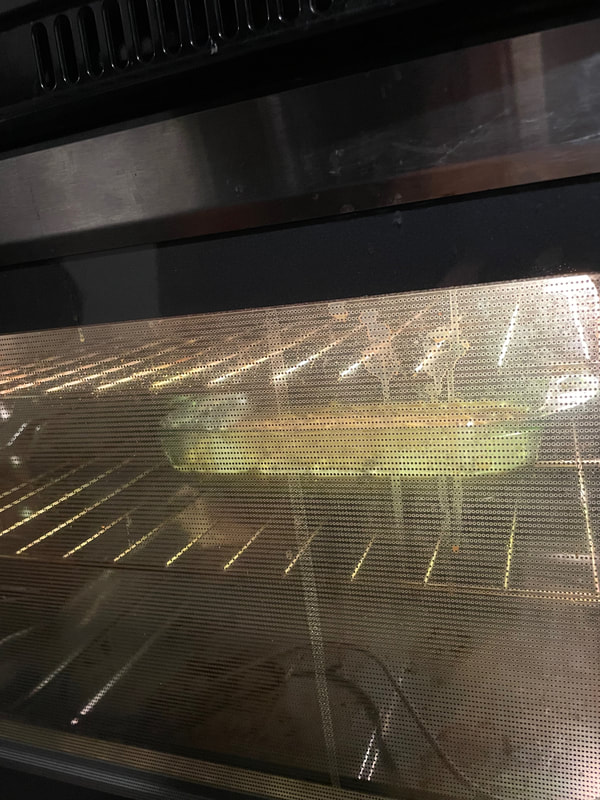
Happy Sunday everyone! I recently made some bread pudding and wanted to share what an easy breakfast/dessert it is! For those who don't know what bread pudding is, I think it can best be described as French toast but in casserole form. Whenever my husband and I have the "butt" ends of the bread left, I throw them in the freezer. Over the span of a few months, we had collected a good amount of white bread ends, as well as a little bit of sourdough and some bread I had made. I will say that sourdough is not my bread of choice for bread pudding as it is a bit tougher and bread pudding is best with a soft bread, but it worked out fine this time as I had just a tiny bit of it. I will also say that you should probably put the bread into freezer bags before throwing it into the freezer, but I won't pretend that I don't just throw it in there in its original bag ..... 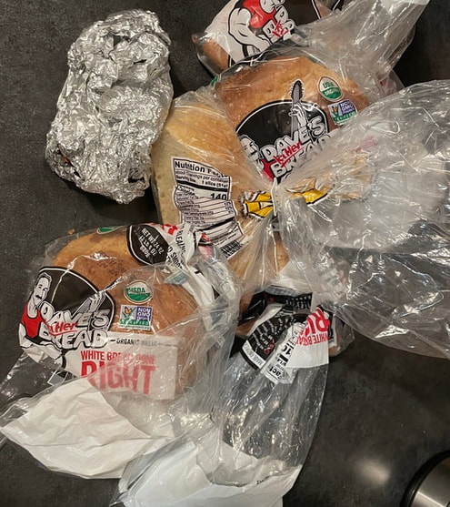 The first step with bread pudding is to cut up the bread into small pieces like so: 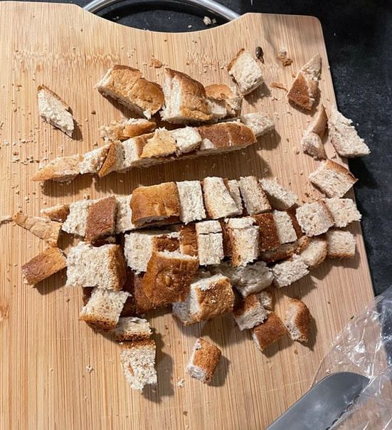 Throw all of your bread into a bowl and put t aside for a moment. I will say I never really decide what size of pan I will need until my bread is all cut up. I like a thicker bread pudding so I usually use a smaller and deeper pan as opposed to a larger, shallower one. The other key component of bread pudding, besides the bread, is an eggy, milky mixture. The goal is to have enough liquid so that all of the bread is fully soaked. For this amount of bread I ended up using about 8 eggs and maybe a cup each of half and half and oat milk. I also added some sugar (however much you feel is right), as well as some cinnamon and vanilla. 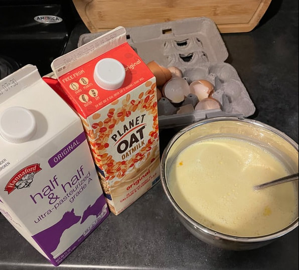 Once the eggs and milk are all mixed up, you can then pour it over the bread and mix together until fully combined. The bread may start to get a little mushy but that is fine! 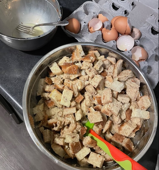 Next it is time to plop all of the bread into a baking dish! I would recommend buttering or greasing the pan so that the cooked bread pudding is easier to get out when cooked. If you see a little bit of the eggy mixture pooling at the bottom, that is okay. It will all get soaked up as the pudding cooks! 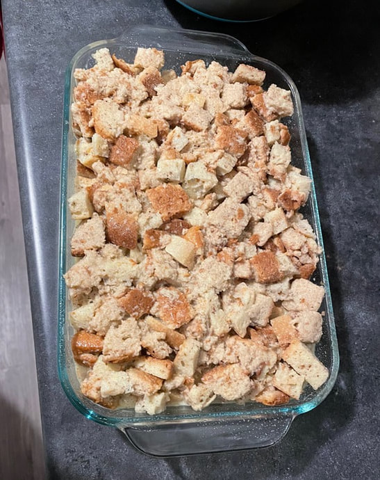 I ended up cooking my bread pudding for about 45 minutes at 350° Fahrenheit, but this would depend on the size of your pan and thickness of the bread pudding. I forgot to take a picture of it once it was just out of the over, but here is the cooked pudding with some already enjoyed! 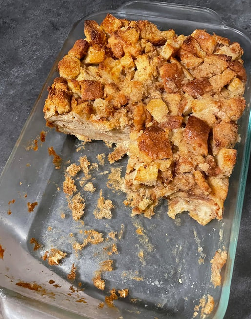 You can also go for a savory bread pudding, but I have always preferred a sweet version! We usually eat this with some maple syrup or some cut up fruit and whipped cream on top. It is a great way to use up the end pieces of bread that may otherwise go to waste. If you give it a try, I hope you enjoy!
- Rebecca P.S. Today's photo on the homepage is from Pexels user Mariana Kurnyk: www.pexels.com/photo/sliced-bread-on-gray-surface-1775043/
2 Comments
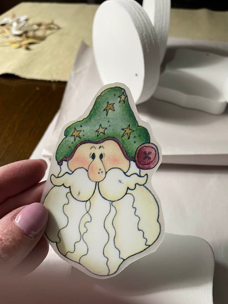
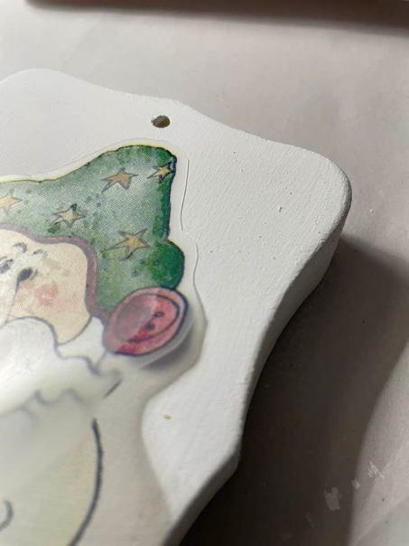
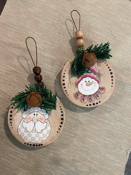
Hi friends! This is Suzanne, Rebecca's mama, happy to be back with you on the Patterned Paper Plate. For today's craft I'm going to highlight some products that we have never talked about before. Though the finished product has a definite Christmas/Winter feel, the products I'm using can be adapted for any season or holiday. To begin this craft, I have some chunky wooden pieces that I picked up at the dollar store quite a while ago. I also have some chalk paint, a foam brush and some rub on decals. I’ll talk a little more about the chalk paint and the rub on decals because these are extremely versatile craft items to have in your stash that can be adapted to so many different kinds of craft projects. 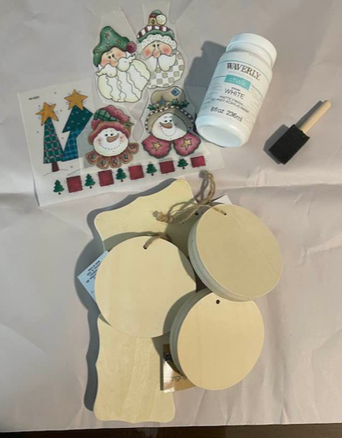 To begin I removed the labels and jute hanging string from my chunky wood pieces and gave them two quick coats of Waverly chalk paint. Chalk paint differs from regular acrylic craft paint in that items to be painted require no preparation. As long as the item is clean and dry, chalk paint will stick to the existing surface and instantly transform it. No primer needed and no sanding needed (as long as the surface is relatively smooth and intact). Wood, plastic, even fabric can be painted with chalk paint. The only surfaces it doesn’t do great with are metal or something quite slick, like laminate. 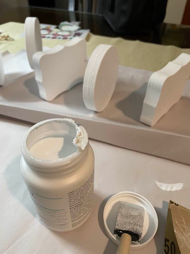 Another real plus of chalk paint is that it is quite thick and dries very quickly. Often just one coat of chalk paint is enough to give good depth of color and coverage. Because my wood pieces were quite dry, I opted to give them two coats but since chalk paint dries so quickly, I was able to give the first one its second coat immediately after finishing painting the last one. You can also make your own chalk paint by mixing unsanded grout (as you would use in tiling) into regular acrylic paint, but the real thing is relatively inexpensive and readily available at most craft stores. Let's talk a little now about rub-on transfers. Rub-on transfers are basically a painted image that is complete and can be transferred from its carrier sheet directly onto your painted surface with just a little bit of pressure. 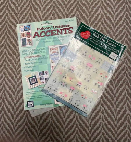 Rub-on transfers are also readily available at craft stores and even the dollar store. To apply the rub on transfer, you should trim fairly close to the outline, peel off the backing parchment paper and lay your transfer down on your piece. The back of the transfer is slightly adhesive so it will stay where you put it down. Rub gently over the front of the transfer to disengage it from the carrier sheet and adhere it permanently to your item.
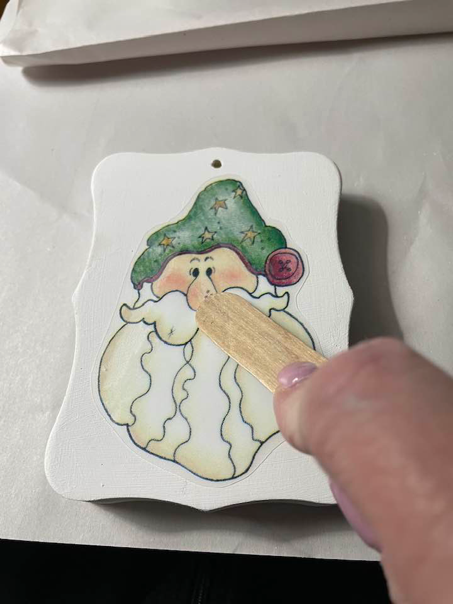
You may be able to see from the picture below the change in color when you rub on your transfer. The image will go from being clear and crisp to being slightly milky. That's a good indication that it is released from the carrier sheet and is now adhered to your item. When you've completely rubbed the transfer slowly start to peel up the carrier sheet to be sure that you have the entire image completely transferred. If you have areas that are not completely transferred, carefully lay the carrier sheet back down and continue to rub to ensure a full transfer.
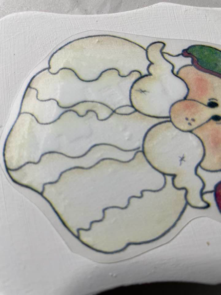
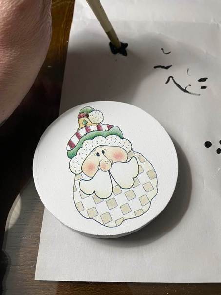
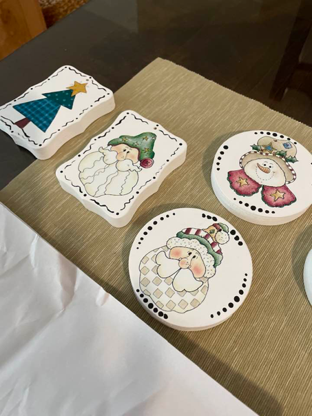
Once you've completely adhered the transfer and pulled the carrier sheet off, put the backing parchment over the image and give it another gentle rub to ensure complete adhesion to your item. Rub-on transfers are great for people, like me, with limited artistic abilities. They give items a hand painted look and because the transfer itself is paper thin, once adhered to your item, everything is as flat as a painted image would be. 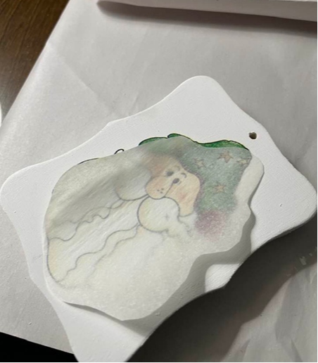 Once I adhered the transfer to each of the five pieces of wood, I got out some black paint and added a little detail to the edges of each piece. For the rectangular pieces I used dots and a small squiggle between them to outline the piece and on the round pieces I used dots made with the end of a paintbrush to define the edges. These graduated dots are easy to make - dip the tip of your paintbrush into the paint and continue to make dots without loading paint back on to the tip. As you use more and more paint the dots will become smaller in size. After adding the black details I let the items dry completely overnight and it was time to decorate them.
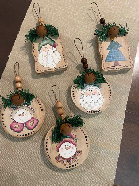
To decorate, I pulled out another great product called Waverly antiquing wax. I also grabbed some beads, some rusty wire and some rusty bells from my stash. 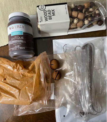 For each hanger I cut a length of the rusty wire and strung three beads on it, pushing the beads up as far as they could go to create a small hanging loop. 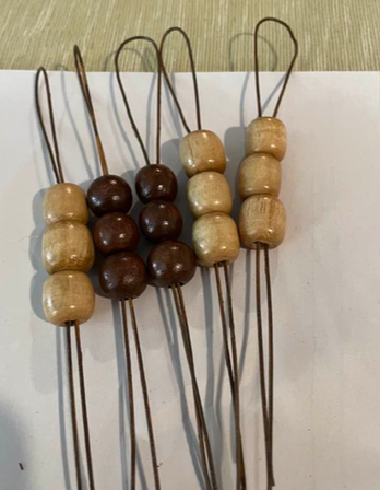 Before adding the bead hangers, I wanted to knock down the brightness of the white on my items, so I used a bit of the antiquing wax. Antiquing wax is a thin brown wax that rubs on and buffs off very easily. Because the transfer itself is somewhat glossy the wax did not really stick to the transfer but did give the white surface a nice antique feel. 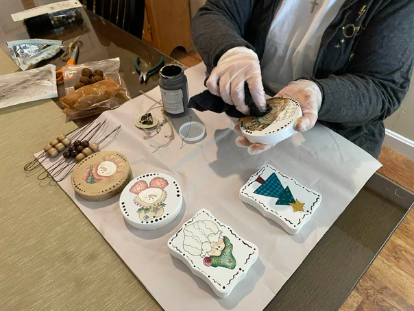 I then pushed the end of my wire hanger through the hole in my chunky wooden piece from the back, put the ends through the bail of the rusty bell and before twirling the ends of the wire to keep the bell in place I added a small piece of greenery behind the bell to add interest. 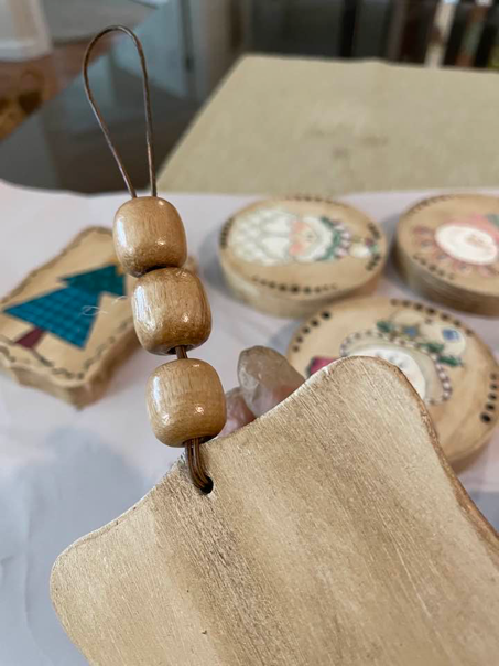 That's it! Five super cute little holiday decorations that will go into my craft fair box ready for the next season.
While these items are more wintery, you could do this same process with transfers applicable to any season and look like you have prodigious painting skills - even if you don't. I hope you've enjoyed this look at a couple of new products and will go do something crafty today.
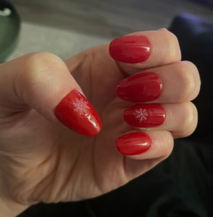
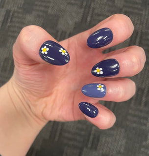
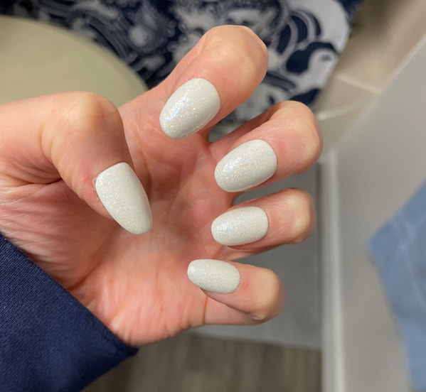
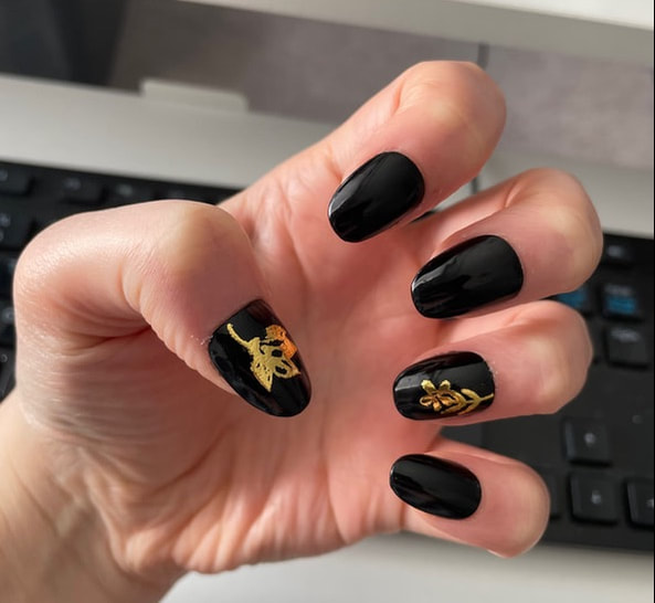
Thank you to my mother for her lovely blog today! - Rebecca P.S. Today's photo on the homepage is from Pexels user Jessica Lewis Creative: www.pexels.com/photo/red-fruits-on-table-699380/ Hello everyone! I hope you all are having a lovely Easter, if you celebrate! Today I wanted to share something a little different and talk about how easy it is to make your own nails at home if you wanted to give it a try. I go through phases with my nails where sometimes I want them to be natural and other times I want colorful talons so I have spent some time teaching myself how to make my own fake nails for the occasions when I would like them. Here are some examples of ones I have made in the past: 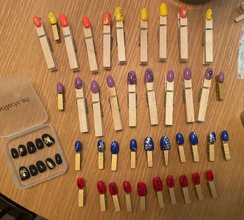
To start off, I got myself a large set of false acrylic nails off of Amazon. You can get boxes of about 500 nails for under $15 dollars. The brand that I bought most recently was called UNA GELLA and I went for a short almond shaped nail. I sometimes cut down the nails to make them even shorter, but lately have been keeping them a bit longer, the length that they originally come. 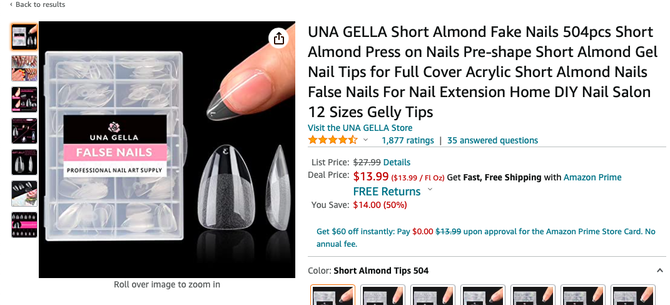 You could also buy a holder that is specifically meant for painting nails, but, as you can see in some of the photos above, I use wooden clothespins instead as a cheaper option. I put a few little squares of foam adhesive on the clothespins and then stick the nails on top. This provides enough stick to keep the nails in place as I work on them, but they are also easy to remove once I am done. 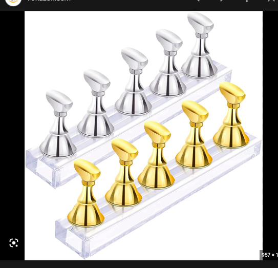 I test the size of the nails against my natural nails to be sure I have a set that fits me properly. You may even find that the same finger on each hand is not the exact same size. Once I have picked the nail sizes that work for me, I then start by using a nail file to buff the nails up a bit as I feel like this helps the polish adhere better. I'm not sure if you can tell in this photo, but the bottom nail is buffed and the top one is still shiny. 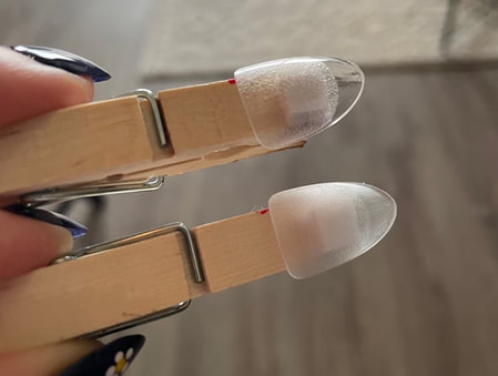 Once all of the nails have been buffed, I then go in with whatever base coat I would like. For these nails, I wanted to try a colorful French tip so I just went for a nude color. I mixed a darker nude and a light pink together to get the shade I wanted and then did 2 coats. 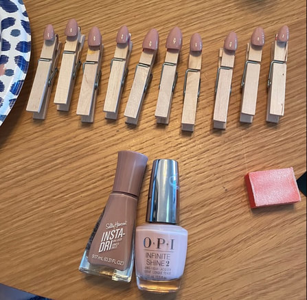 Once the base coat was dry, I then went in and freehanded some French tips in different colors. You can also find some French tip sticker templates if you want to make sure your French tips are very precise, but frankly I am too impatient for that. If you only have a few nail polish colors, you can always mix them together just like paint to get some variety in your shades. 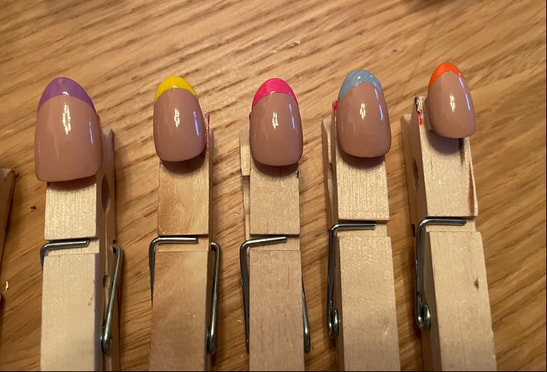 Once the tips were dry, I then went in with some white nail polish to start making some flowers. One nail tool that I do have is this little metal tool with balls at the end to help make dots. These can be found at any drug store and make adding details much easier. 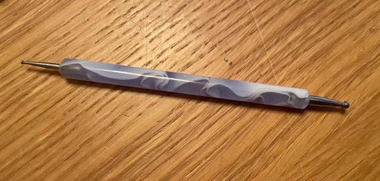 I used the smaller side of the tool and did 5 little dots to look like a flower on each nail. 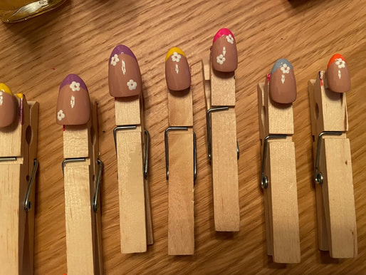 I also ended up putting a little black dot in the center of the flowers as you will be able to see in the final pictures! I then gave the flowers a good 2 hours to dry before doing a top coat. Something I have learned is don't do too many stokes on the top coat as there is always a chance you can make the lower nail polish wet again and smudge your designs. I ended up doing 2 coats of clear top coat. 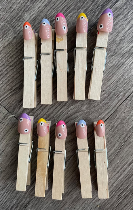 I also always let my nails dry overnight fully before putting them on to make sure there is no chance of smudges. I do not have a specific brand of nail glue or nail adhesive tabs that I use so find what is best for you!
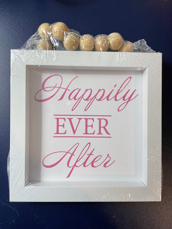
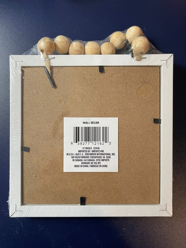
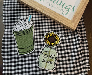
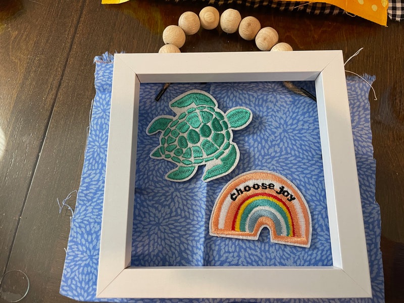
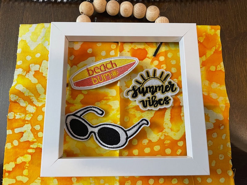
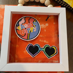
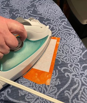
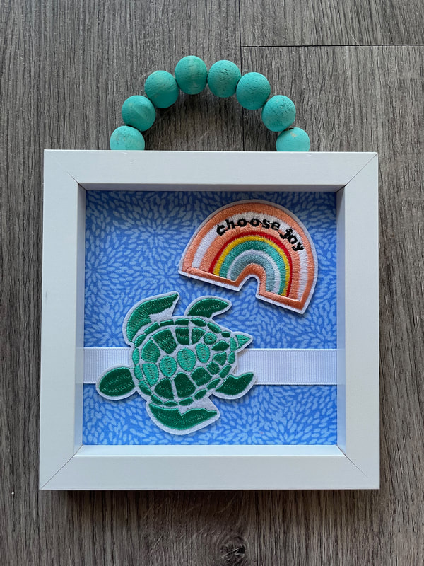
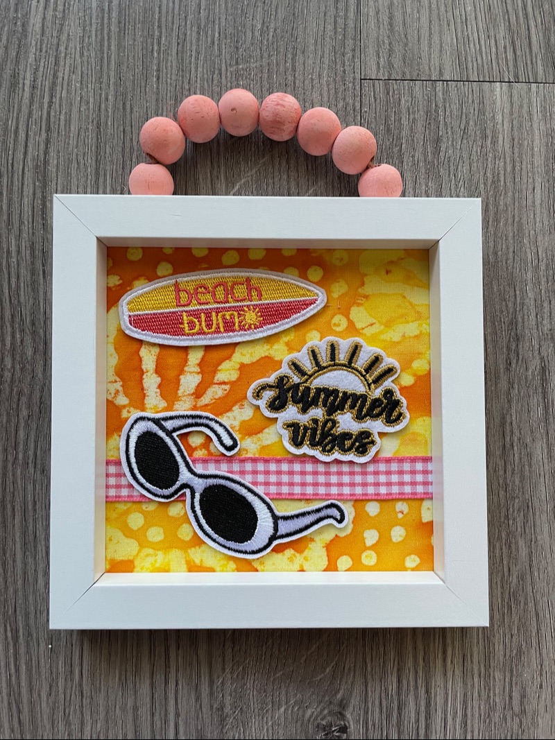
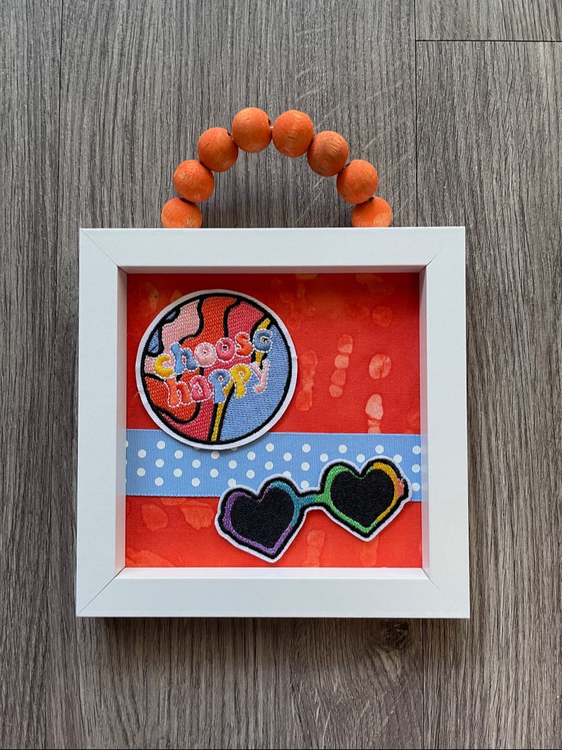
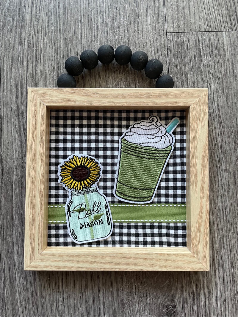
And that is how I make some false nails at home when I feel like wearing them! It is not too hard to do and can be relatively cheap once you have the base set of supplies required. Let me know in the comments below if this is something you would ever try! - Rebecca P.S. Today's photo on the homepage is from Pexels user Lisa Fotios: www.pexels.com/photo/woman-with-black-manicure-holding-white-and-grey-floral-ceramic-cup-851219/ Happy Sunday night everyone! Tonight we have a short little blog about a fun project my mother and I worked on last week, some cute decor frames which feature some fabric and iron-on patches. I recently bought some patches from Amazon that were meant to be either iron-on or sew-on and was looking for something to do with them. Here's a few of the patches I got to give you an idea of what they look like: 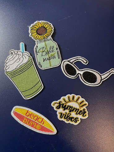 I also had some frames that my mother had given me recently as she had not yet thought of something to make with them. They were originally from the Dollar Tree and have wooden beads along the top for hanging. The frames already had some art/words in them, but that ended up being covered up.
Once I picked the iron-on patches I wanted to use, my mother and I had a brainstorming session about how to best make the patches look like they made sense in the frames. The answer was fabric! I went shopping in my mother's fabric stash and then we went to Walmart's fabric section as well to get some fun pieces to use. Here are the patches I picked, along with the fabric to go with them.
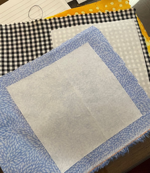
My mother really took the reins on the fabric piece which I appreciated! She cut a piece of cardstock that fit into the frame and then attached the fabric to the cardstock with some heat-activated fabric adhesive.
I also went ahead and painted the wooden beads on each frame to match the colors of the frame. 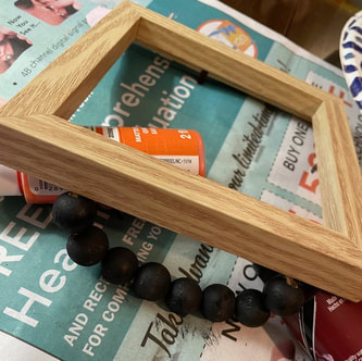 We then felt that the frames needed a little extra something so we picked some ribbon that matched each frame. 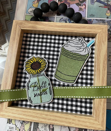 The ribbon was attached with some double-sided tape and then the patches were glued down with some hot glue just to ensure they were really stuck on there. Four frames have been done and here's what they are looking like:
I didn't quite know where these frames would go, but I am happy with how they turned out! Thank you again to my mother for the creative consultation :)
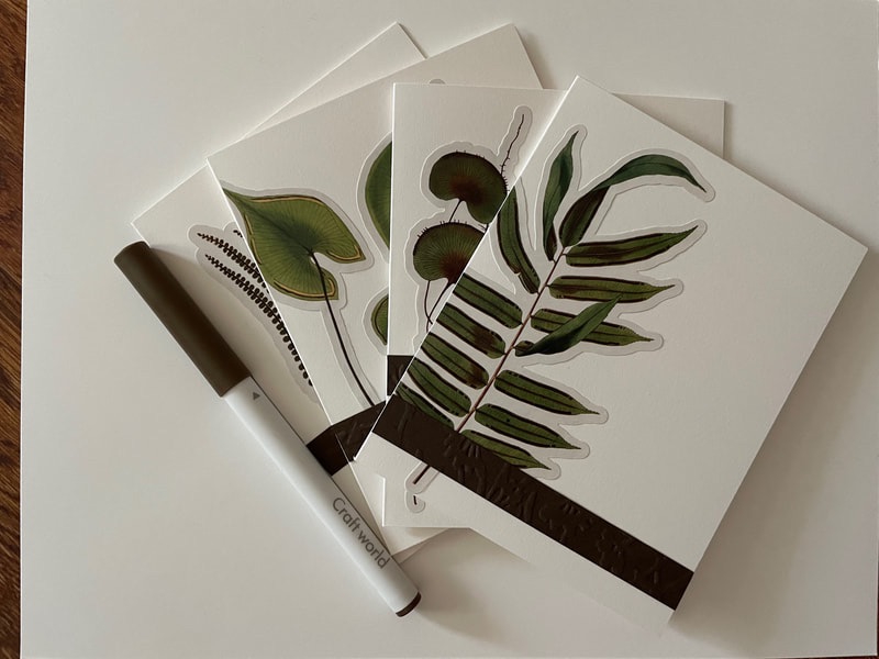
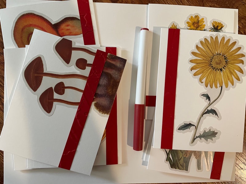
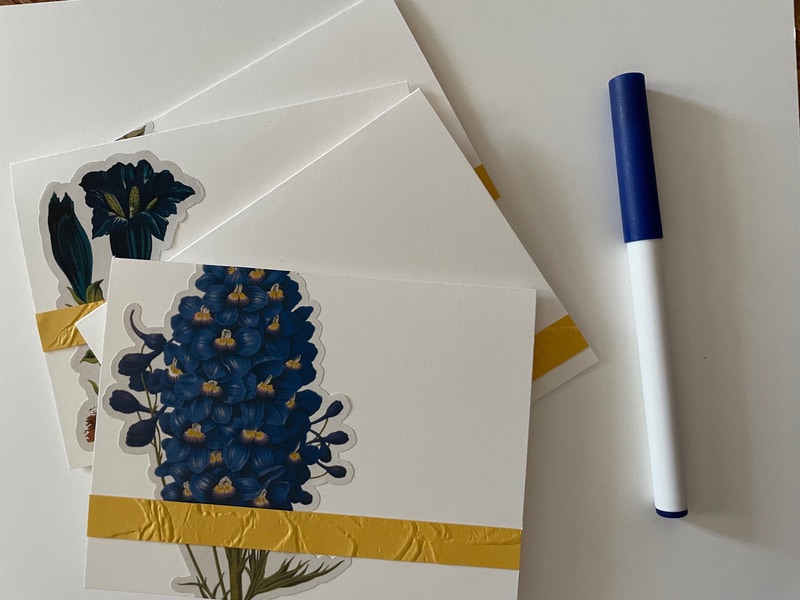
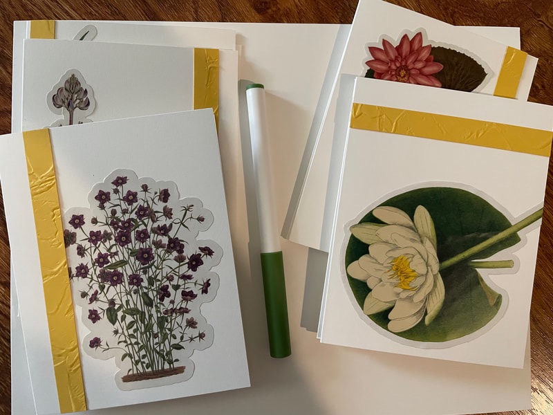
I got some additional patches and have a few other frames left so am excited to make a few more! I think I'll be putting these on the Etsy shop when I've made a few more so I will let you guys know if I do! - Rebecca P.S. Today's photo on the homepage is from Pexels user Digital Buggu: www.pexels.com/photo/pile-of-area-rugs-365067/ Happy Sunday everyone! Today I am FINALLY back to show you how the floral card sets I was making turned out. My apologies for how long it took ... As I've mentioned I really don't enjoy making cards so it takes me a long while to do them. But we are back! In part 1, I had ended with all the cards stickered and paper in an accenting color that had been embossed and cut into strips. Here is part 1 if you would like to catch up: floral-notecard-sets-part-1.html Next step was to use the Cricut to write out some sentiments for the cards. I picked out a Cricut pen that matched the colors of each card set: brown for the leaf cards, blue for the blue flowers cards, red for the yellow flowers and mushrooms and green for the purple flowers and lilypads.
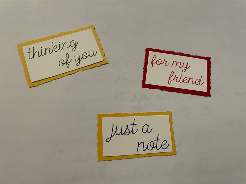
Fun little story time: I showed my mother how to use the Cricut to write out sentiments and she HATED the process of doing it! She said that she would much rather use a stamp and ink pad to stamp out sentiments than use a Cricut in the future. As I mentioned in part 1 of this project, she often helps me with cutting paper as that's a task I don't enjoy doing at all, but she loves to do. All this to say that you don't have to love every single aspect of crafting. It's okay to push yourself out of your comfort zone sometimes to try new things, but its also fine to find what you enjoy doing and stick with that! I used a handwriting script to write out the sentiments. For each set of 4 cards there were the following sentiments: Hello, Thinking of You, For my Friend and Just A Note. 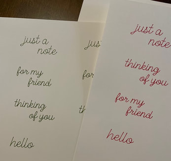 Now it was time to mount the sentiments on some paper that matched the paper that was used for the embossed detail. I cut a rectangle around each sentiment using a straight edge, but then for the colored paper mount I used something called a deckle-edge cutter. I had actually bought this for my mother for Christmas as she had been wanting one so it was fun to give it a try! A deckle-edge cutter has a blade that looks like this:  Instead of creating a straight edge, it leaves the paper with a ruffled, hand-torn effect. The nice thing about using a cutter like this is that it allows you to get that more organic look while still being able to be intentional about where the cut is made. Once the sentiments were mounted, I then attached them to the cards with some foam mounting squares. These lift something off of the front of the card slightly to give the card a little more visual interest.
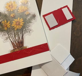
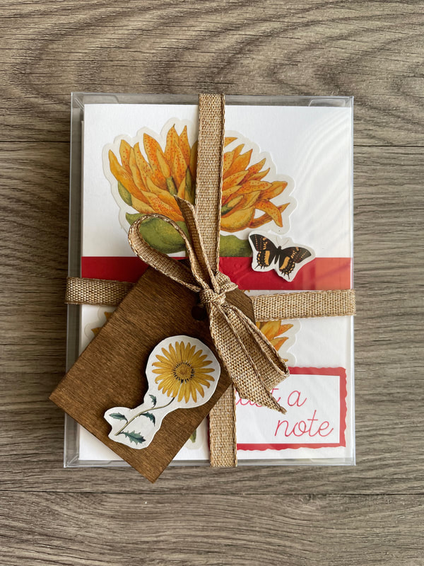
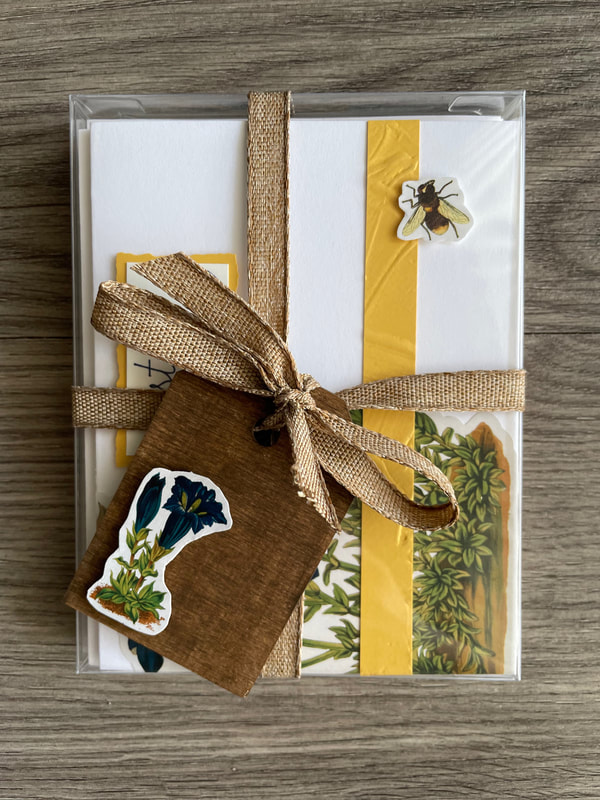
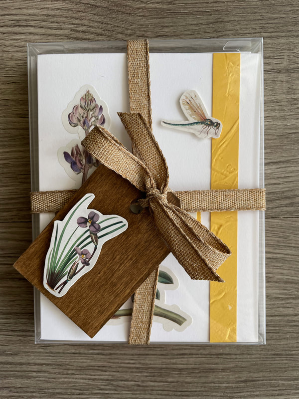
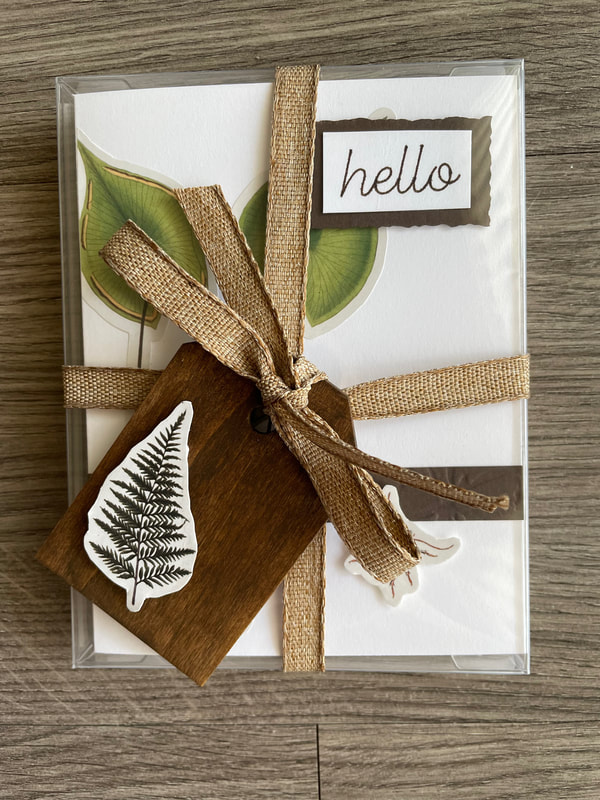
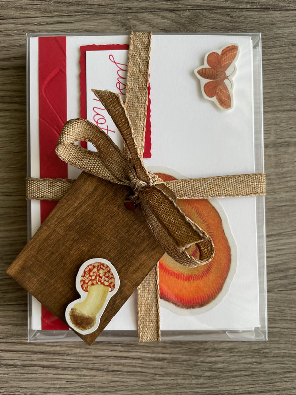
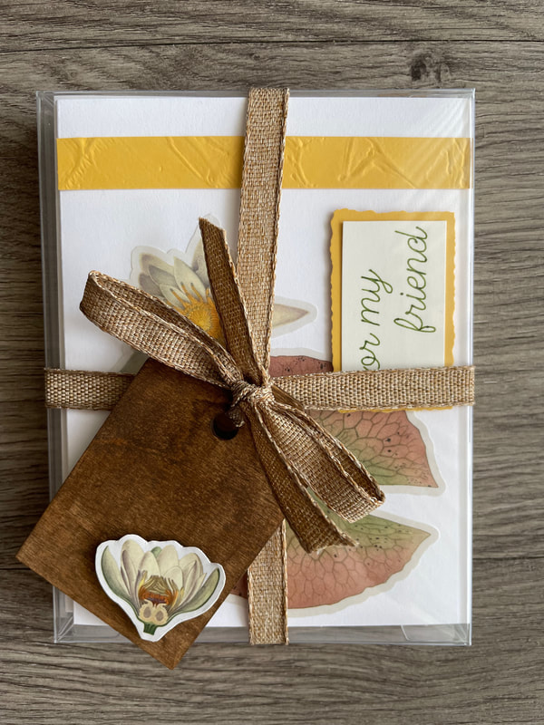
Finally, I went back into my sticker book to find a small insect sticker for each card, glued them to some cardstock for extra support, cut them out and used foam mounting squares on those as well. 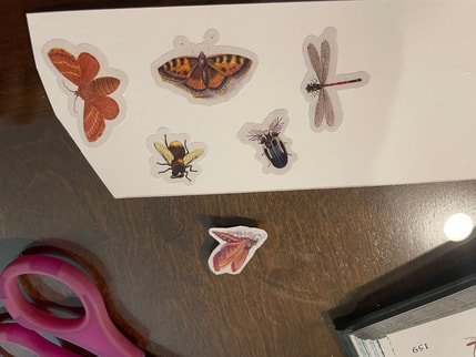 And here are the six sets all done! These took me so much longer than they needed to, but I am very happy with how they came out! Now that I've pushed myself out of my comfort zone with these I can safely say I won't be making cards again for a while :) 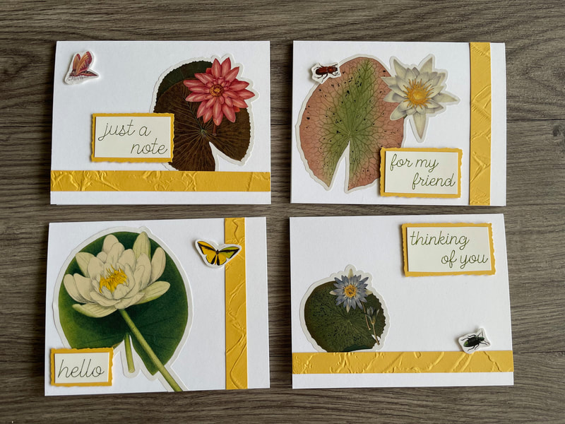 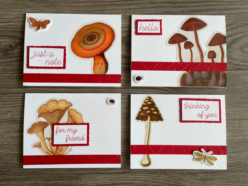 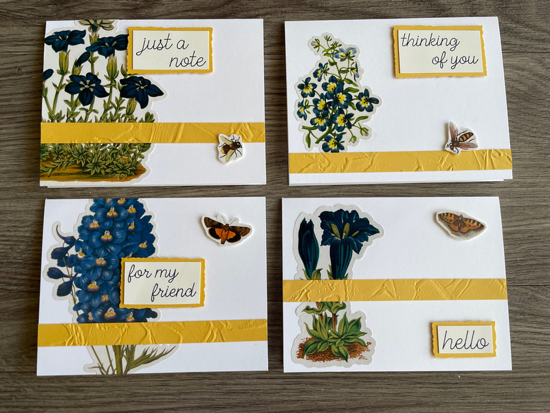 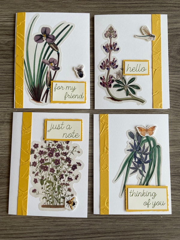 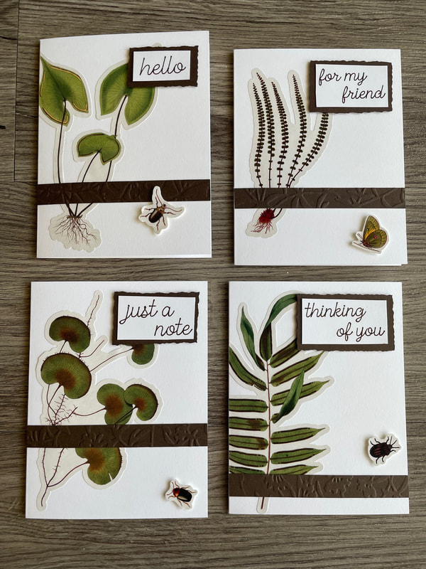 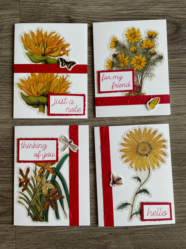 I then took each set of 4 and packaged them up in a clear plastic box with some envelopes that had a matching sticker on them.
If you happen to like any of these card sets, they are now available on the Etsy shop! Feel free to take a look if you are interested: www.etsy.com/shop/patternedpaperplate?ref=shop_sugg
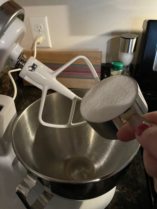
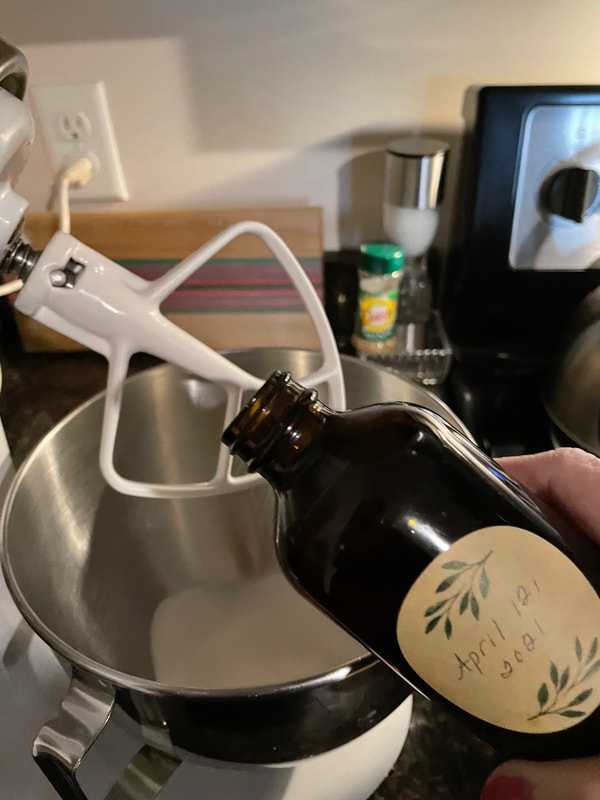
I hope you have a good week everyone! Talk to you soon! - Rebecca Today's photo on the homepage is from Pexels user Irina Iriser: www.pexels.com/photo/red-rose-and-green-leafed-1233414/ Hello! It’s Suzanne, Rebecca’s Momma, happy to be back on the PPP. Today, I’m taking a little detour into the kitchen. At the start of the new year, everyone is feeling like it’s time to get healthy, so I thought I’d try to modernize one of my Mom’s tried and true recipes to make it just a little healthier. The original recipe for Apple Squares is a simple one that makes a delicious cake-like treat. Beat 1 cup of sugar, 2 eggs, ¾ cup of vegetable oil and I teaspoon of vanilla until smooth. Add 1 ½ cups of flour, 1 teaspoon of baking soda and some cinnamon, nutmeg and cloves. Mix in 2 cups of chopped apples and 1 cup chopped nuts (if desired) and bake in a 9 X 13 pan in a 350-degree oven for approximately 45 minutes. The 1st thing I did was to peal, core and chop up two apples. The recipe calls for two cups, but a little more than that has never been a problem in the recipe. 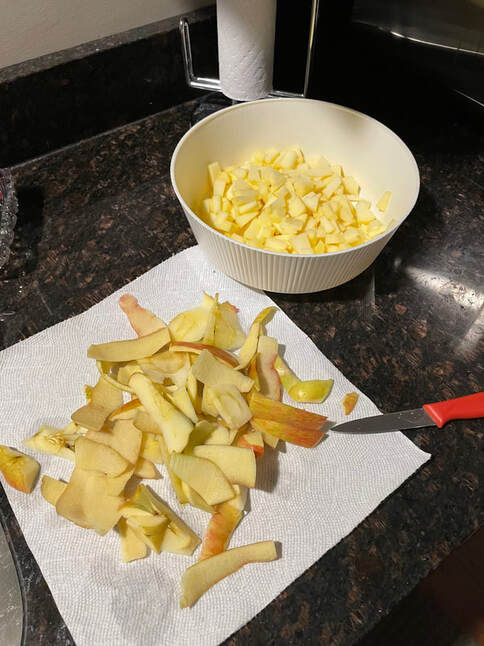 Next, I substituted apple sauce for the oil and creamed together the wet ingredients. Apple sauce can be substituted 1 for 1 for oil, meaning you use the same amount of sauce as you would oil.
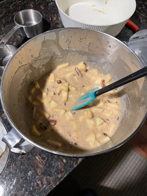
For the dry ingredients, I wanted to cut down on the flour and add some protein, so I added one cup of flour and replaced the other ½ cup with unflavored protein powder. Some online research suggested replacing each cup of flour with 1/3 of a cup of protein powder and to not exceed 1/3 of the flour content of the recipe overall. Since I needed to replace ½ a cup of flour, I need 1/6 cup, which is the same as 2 2/3 tablespoons. A tablespoon is 3 teaspoons, so I needed 2 tablespoons plus 2 teaspoons of protein powder. And that, my friends, is more math than I have done in a really long time! I sifted the flour and protein powder together with my spices to make sure everything would mix in well. 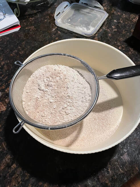 My first concern was that the batter was much thinner than the original recipe makes. After mixing in the flour, you are usually left with a very stiff batter. I’m not sure why, because all my research indicated that the protein powder is denser than flour would be, but I’d come this far, so I decided to forge ahead. I mixed in the apples and some chopped pecans and turned everything into my 9 X 13 pan that had been prepared with some baking spray. It went into the oven and took only about 35 minutes to cook.
I was suspicious of the results because the cake did not rise as much as the original recipe. Some additional research after the pan was in the oven baking (when it was too late!) suggested that the leavening agent (baking powder) should be increased when baking with protein powder. Ah ha! The cake was also much darker that the original recipe. I can’t find any reason why that might be, but perhaps it is just because the cake didn’t rise as much. 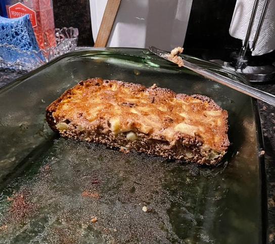 The real test, though, was a taste test. Rebecca and her husband had both had cake made with the original recipe, so they had a good basis for comparison. They said this cake was very moist (thanks to the apple sauce substitution) and much denser than the original. They said the flavor was good as well – no discernable taste difference from the original due to the substitutions.
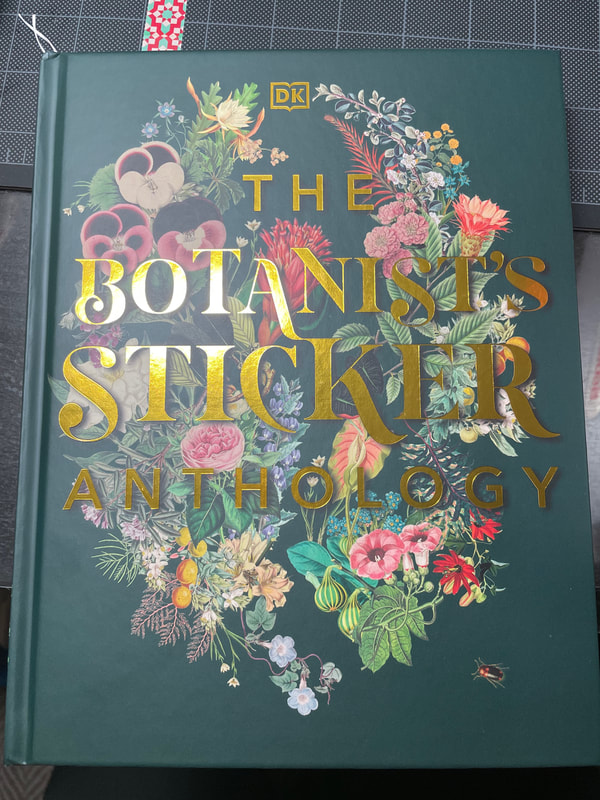
I brought half into the office to share with my coworkers and the cake got good reviews there as well. Overall, I think my experiment was successful and created a delicious, if not identical to the original, apple cake. Taken on its own, I’d call the experimental version more of a bar than a cake, since it was quite dense. I will try again – next time increasing the leavening agent and perhaps seeking out a protein powder expressly meant for baking (if there is such a thing). If you have ever tried to update a recipe, I’d love to hear about your results in the comments. Until next time, happy baking! Thanks to my mother for the lovely spin on a dessert that's been made quite often in our family! I hope to be back next time with a part 2 to the floral card sets. Talk to you soon everyone and don't forget to check out the Etsy shop if you are looking for any Valentine's Day gifts for that special someone or for yourself ;) - Rebecca P.S. Today's photo on the homepage is from Pexels user Mareefe: www.pexels.com/photo/close-up-photography-of-apples-672101/ Hello everyone! So today we are here with Part 1 of a notecard project I started recently. I want to preface this by saying that I generally do not enjoy making cards. I don't really enjoy stamping or cutting paper or folding paper or pretty much any of the steps involved in making cards .... so let's just say this project was heavily inspired, assisted and motivated by my mother who does in fact enjoy making cards! Despite not enjoying card making, I have been wanting to make some recently for the Etsy shop. Recently for Christmas I received this beautiful book of vintage-looking floral stickers which seemed like the perfect first step towards these cards.
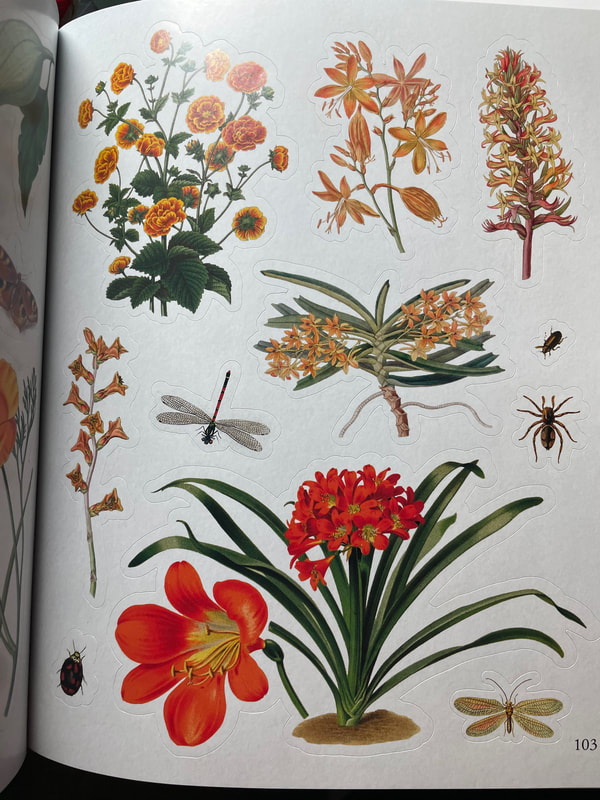
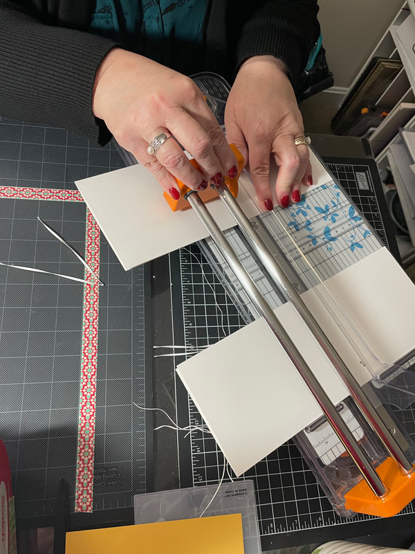
The page above is just a small example of the many varieties of beautiful stickers in the book! The stickers have an off-white edge around the images so my creative consultant cut some card bases for me in a very similar shade.
Once I had the card bases, I was then able to focus on picking the stickers! I decided I would be doing sets of 4 cards so I found 4 stickers for each set that looked good together but did not match too perfectly. Here is an example below! 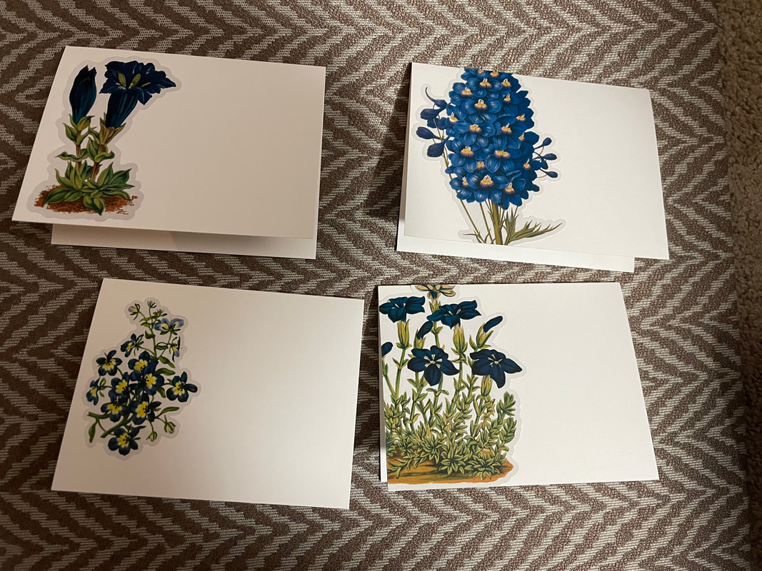 In terms of adhering the stickers to the cards, although they are sticky already (duh), I did also put some glue all over the back as well. When I put the stickers down with no glue, the edges were peeling up slightly which I did not want so I used an all purpose white glue to ensure they were very stuck down. The process was a bit tedious but very worth it! We then picked a corresponding color to use for some additional details on the cards, For these blue flowers, we went with a nice yellow. 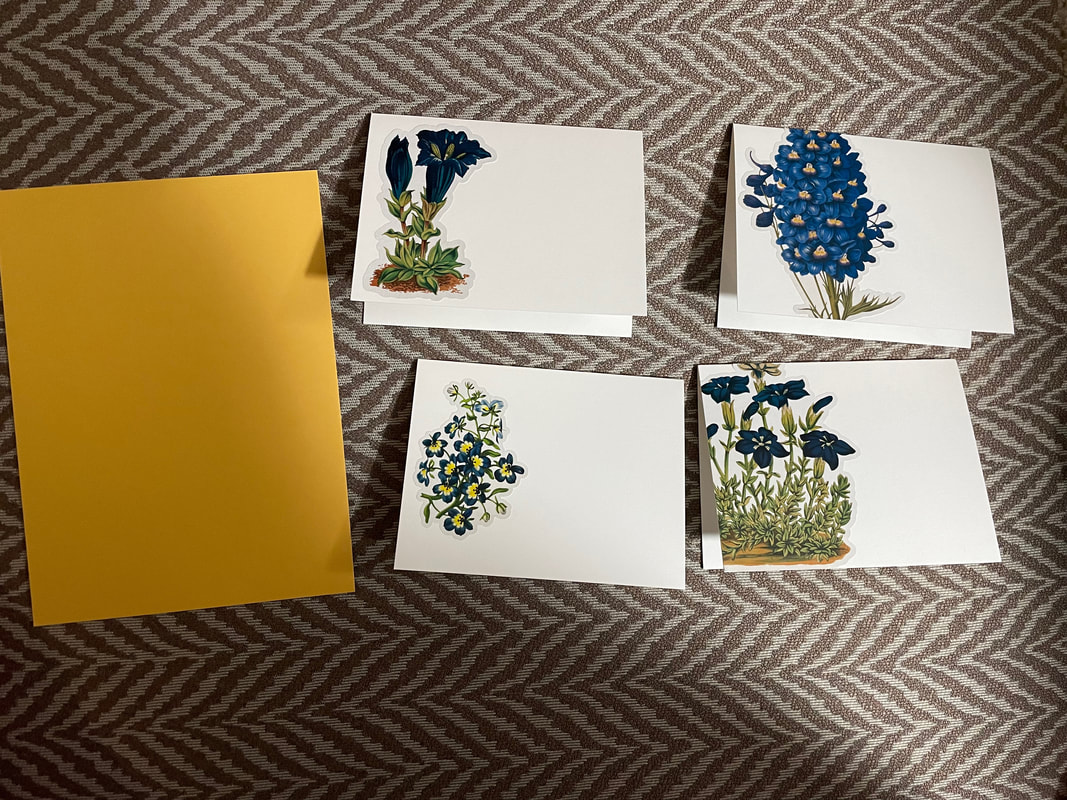 To add some visual interest to the paper, we ran it through my mother's Gemini Junior which is an embossing machine. It is the same concept as the Cuttlebug, only it automatically feeds the paper through as opposed to having to be hand-cranked. 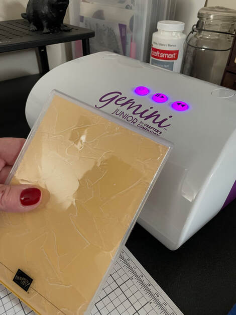 We then cut this textured paper into little strips to be added to the front of the cards. And that is where I will leave you! The next steps in these cards are to use the Cricut to draw out some sentiments and add those to the front and maybe add some additional small stickers if I feel like they need them. Next time I will show you the final product of all the sets as well! For someone who does not enjoy card making, having these beautiful stickers already really helped make the process much easier for me. Having a mother who enjoys cutting paper also helped :)
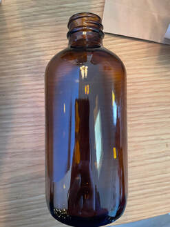
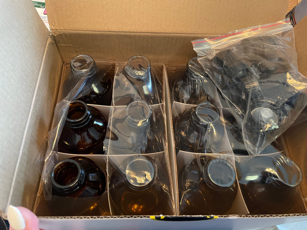
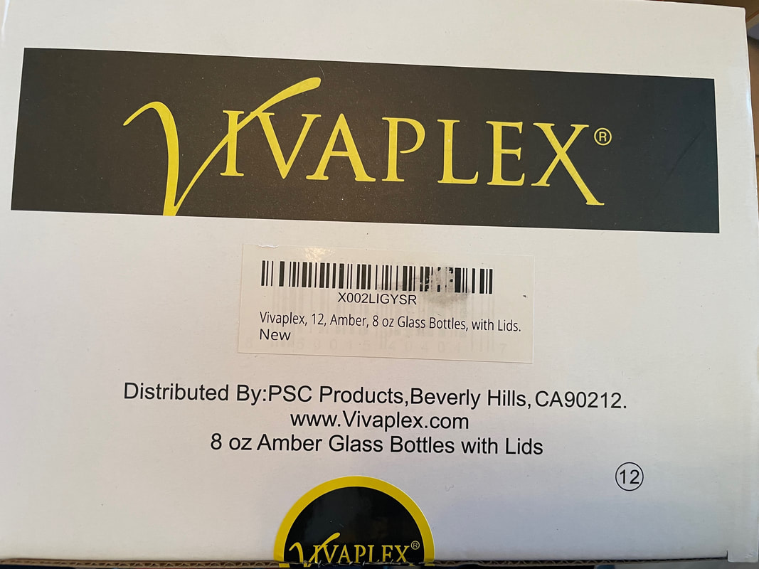
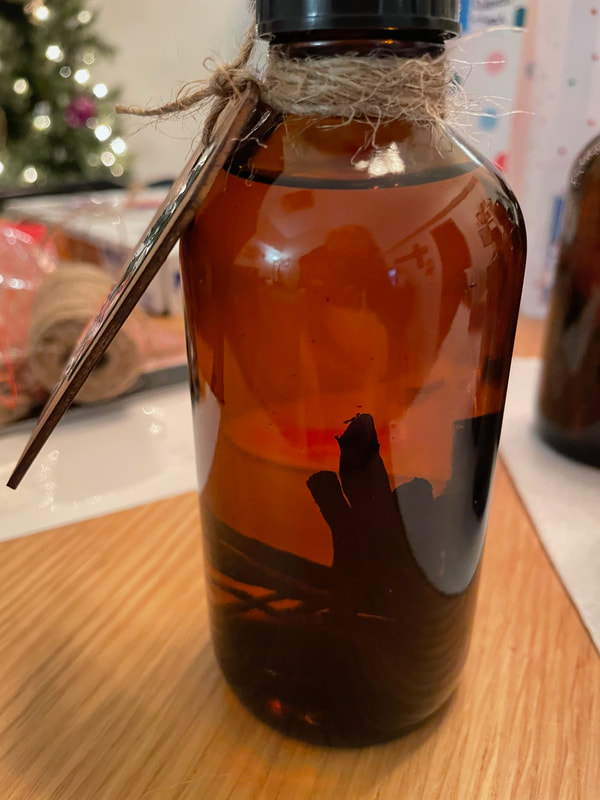
Have a good Sunday everyone! - Rebecca P.S. Today's photo on the homepage is from Pexels user Natasha Babenko: www.pexels.com/photo/selective-focus-photography-of-flower-arrangement-2565348/ Hello everyone and Happy New Year! I'm back with the first blog of 2023 and today I am sharing a simple gift that you can make for anyone you might need to this year. This year the annual Christmas party with my mother's side of the family was able to happen again for the first time since 2019 and I wanted to have a small gift to give to my aunts/uncles and cousins. My mother had the idea to do homemade vanilla extract which seemed like a great idea as it is not too difficult to do and hopefully something that everyone would use. I read a few blogs about making vanilla and the advice ranged from needing 2-3 vanilla beans per 8 oz of alcohol to 10 beans per 8 oz. I ended up going with about 5-6 vanilla beans per 8 oz to keep the project a little more cost effective. I bought two packages of these vanilla beans from Amazon. The beans were already split down the middle; if they had not been, I would have had to cut each bean individually which frankly seemed like something I did not want to do! There is also a difference between Grade A and Grade B vanilla beans, the Grade B are usually a little less "pretty" which is why they are great for using for extract. 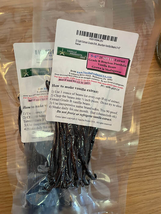 It's better for vanilla extract to be in amber bottles where it is protected from light so I purchased this set of 8 oz amber bottles on Amazon as well.
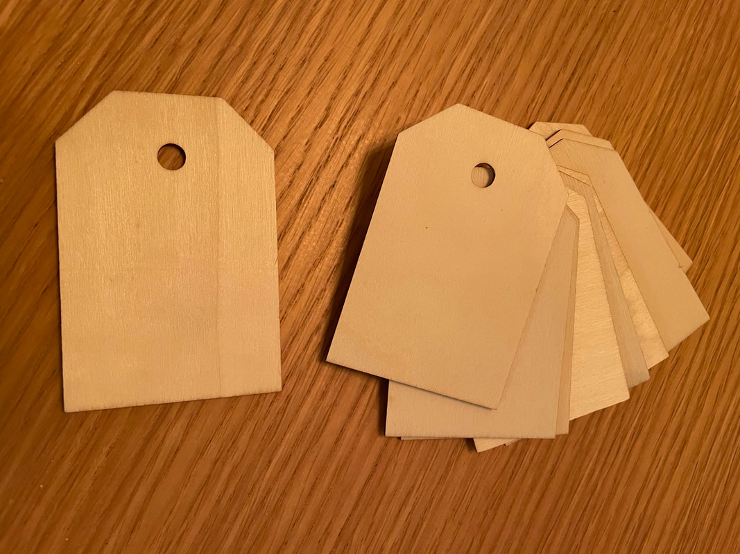
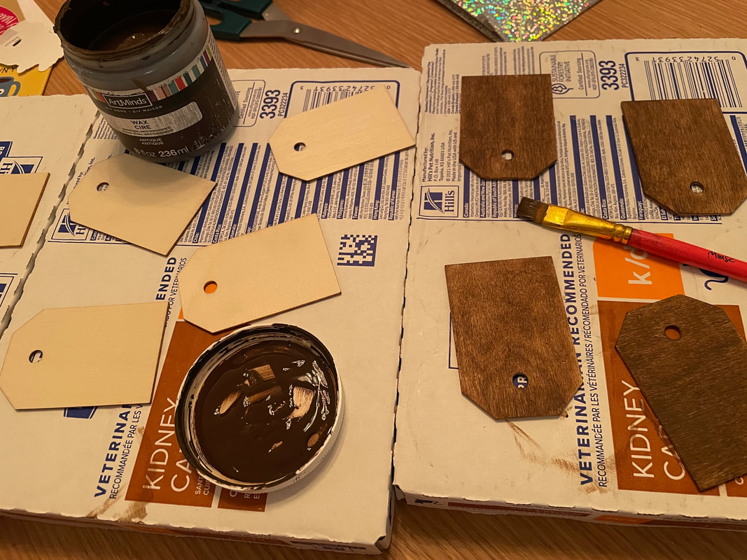
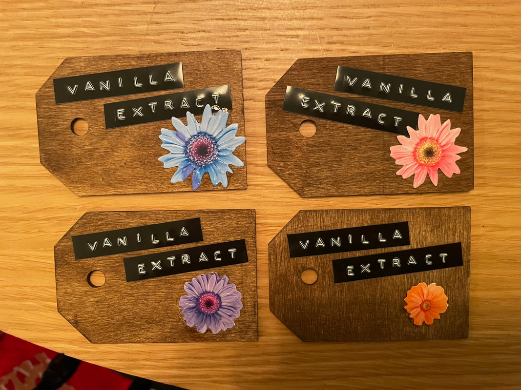
 I wanted to make cute tags for these bottles so I pulled out some wooden tags I have had for a while but not used yet. I used some brown wax to give the tags some color and also provide a protective coat on the wood.
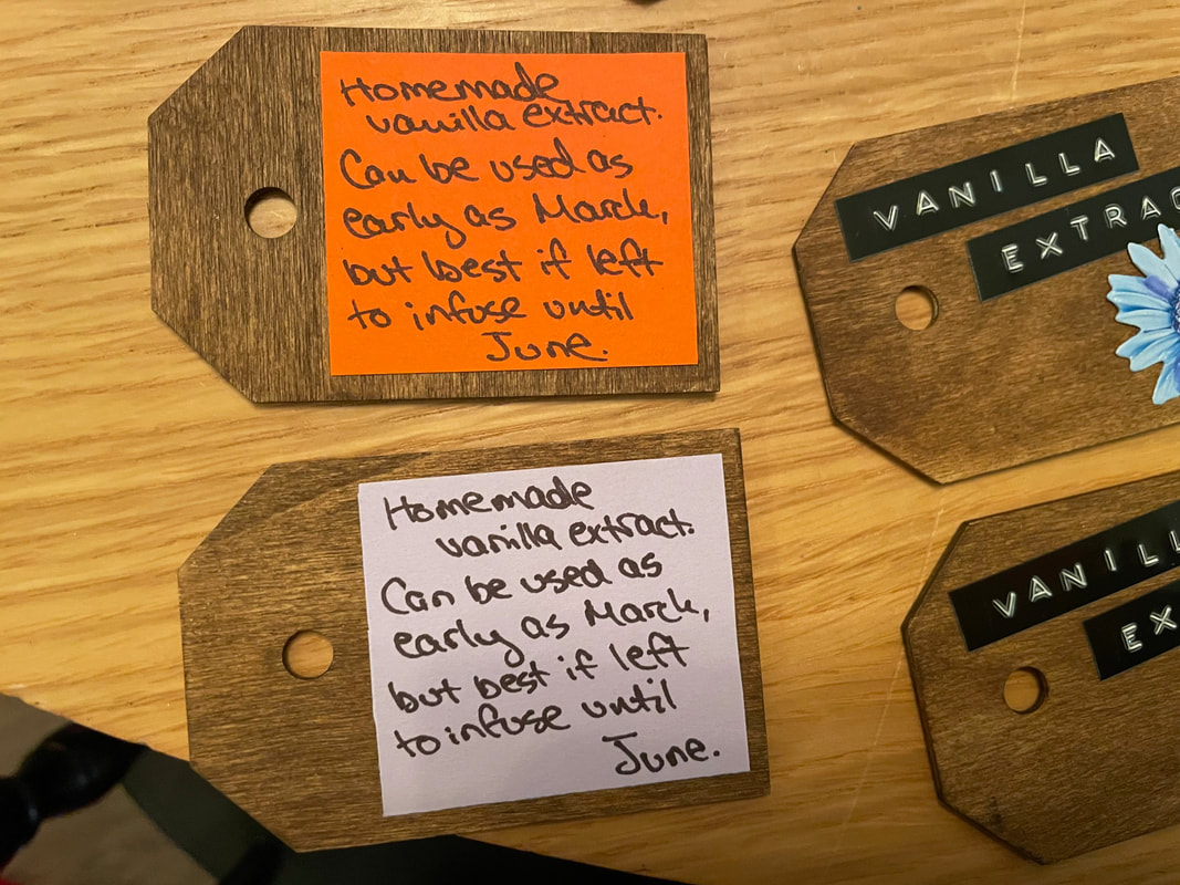
I then added a flower sticker to one side of the tag and a label that I made using my DYMO handheld label maker. On the other side I added a little note about when the vanilla could be used. In my research I also found a variety of opinions on how long the vanilla should infuse for ranging from one month to a full year. Because I ended up using a good amount of beans in my vanilla, I made a tag that said it could be used in about 2 months but would be best if left to infuse up to 6 months.
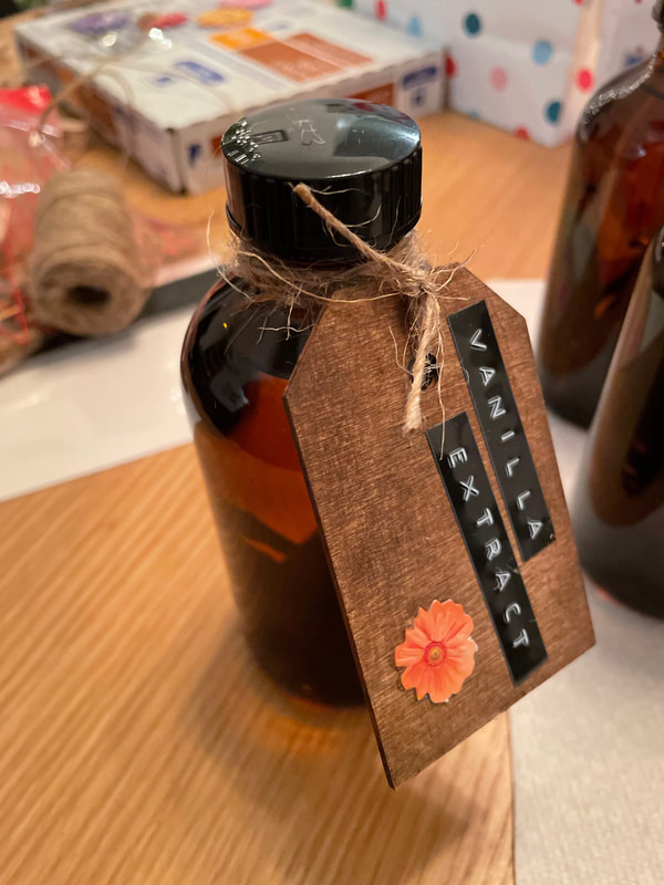
I used 80 proof unflavored vodka for this extract as it has very little flavor on its own and will let the vanilla flavor really come through. I did however make a bottle for my husband and myself where I used spiced rum instead of vodka as I wanted to experiment and thought it would be fun to try with rum. Hopefully it's good when we end up using it! I ended up needing about 3 regular sized bottles of vodka to make 10 8 oz bottles of extract. As I mentioned, my beans were already split so all I had to do before putting them in the bottles was group them in bundles of 5-6 and cut down the middle so they would fit. And that's really all! Once the beans and vodka were in the bottles, I closed them up and then used some twine to attach the tags to the bottles.
I was really happy with how these bottles came out and I think this is a great gift that allows you to make many gifts at once without having to think of a specific gift for each person. Everyone seemed to like it!
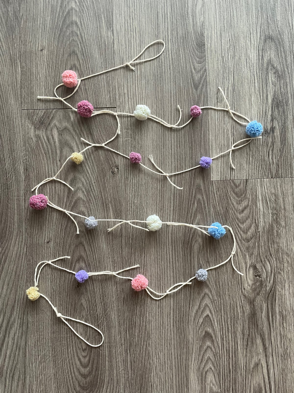
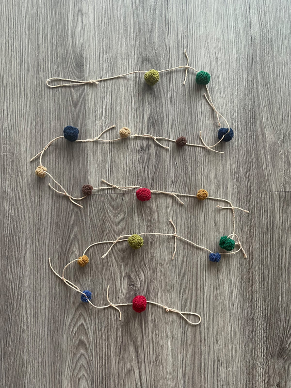
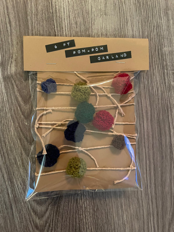
Here's hoping everyone has had a great start to the year so far and that it continues to go well! - Rebecca P.S. Today's photo on the homepage is by Pexels user Qwirki & Co. www.pexels.com/photo/food-love-woman-art-14381802/ Happy Sunday evening everyone! Today we are here with a quick and cozy blog project. I have a cute pom pom garland from Target in my office/craft room and have always been interested in making some of my own for the Etsy shop. I saw these pom poms at the Dollar Tree and knew I had to give it a try! My mom provided the string/twine for the project and was my creative consultant throughout! 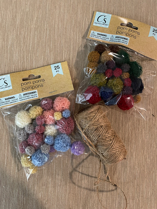 The first thought was to use a needle and string the pom poms on the twine, but we discovered that there was no core to these pom poms so trying to pull a needle and string through was actually just making them unravel. My mom then had the smart idea to tie the string around the pom poms and tie several knots tight enough around the pom poms that they re-pommed around the string. This didn't work on the tiniest of the pom poms in the pack so we stuck with the medium and larger sized ones. I wanted the garlands to be about 6 ft long so it really helped me to line up the pom poms in a row to keep the sizing correctly. The photo below was from before we had to take out the smallest ones! 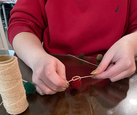 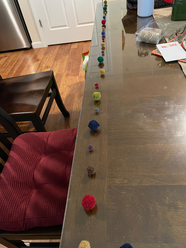 I finished the garlands off with a loop on each end for hanging and then tied some smaller pieces of twine/string in between the pom poms to add some additional interest. I also added a dot of glue on each knot to keep everything secure. 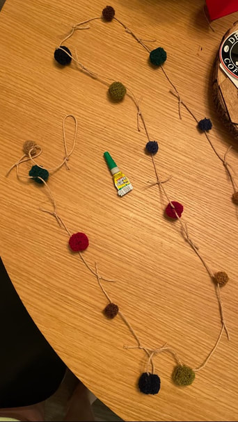 And here are the 2 pom pom garland varieties! I bought 6 packs of pom poms in all so I was able to make 3 of the darker-toned ones and 3 of the pastel ones.
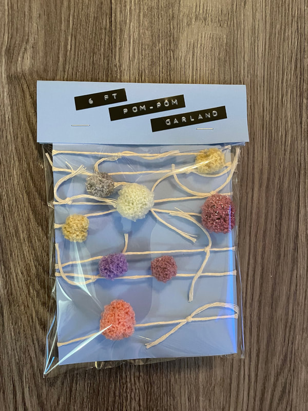
I packaged these up with some clear bags and a topper with a label.
And that's all for today friends! This was a very quick and satisfying project if you're looking for a crafty project that you'd don't have to get too invested in. These garlands are up on the shop now if you are interested!
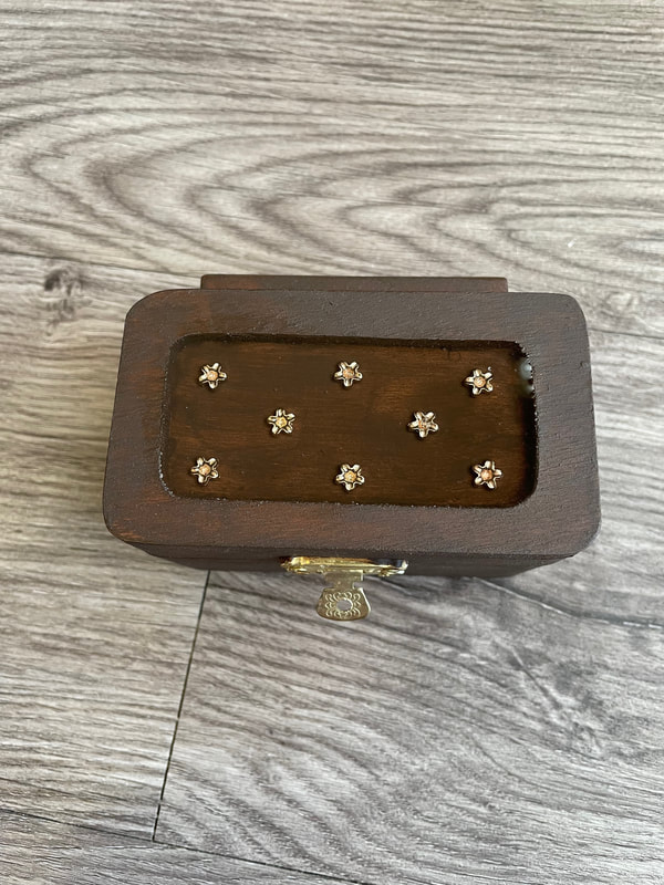
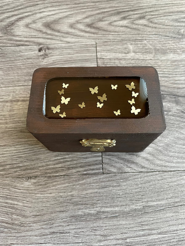
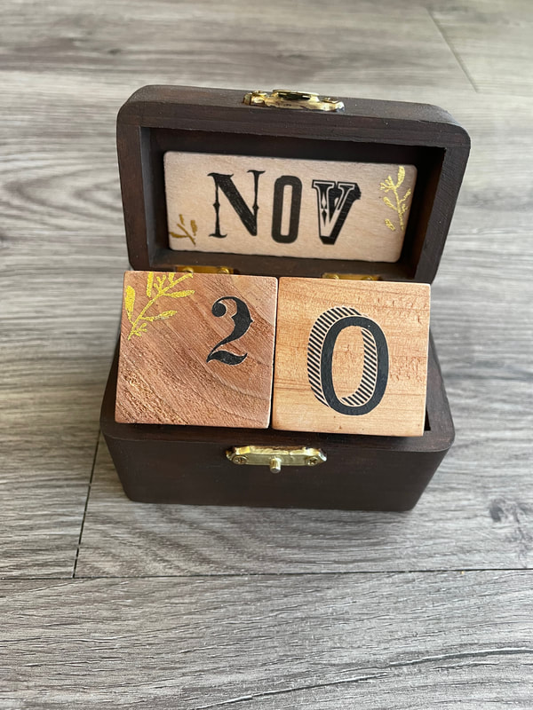
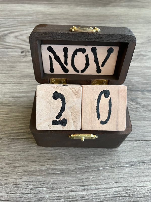
- Rebecca P.S. The photo on the homepage today is form Pexels user Алекке Блажин: www.pexels.com/photo/high-angle-shot-of-bobbin-lace-borders-and-fuzzy-pom-pom-on-white-surface-8140345/ Hello everyone! Sorry its been a while but it has been a crazy week or so in my life. But we are back with another blog! This is the final part of the perpetual calendar project that I have been working on for a while. I have already showed you the house calendars, but today I will be showing you how I turned some little wooden boxes into calendars! If you are interested in Part 1 and Part 2 of this project, here are the links for that: Part 1: perpetual-calendars-part-1.html Part 2: perpetual-calendars-part-2.html I gave a small intro to the box calendars in the other parts, but here is a quick refresher. I was making two wooden box calendars, each of which use the wood pieces below: 1 wooden box with hinges and a latch, 2 wooden cubes, 1 wooden Jenga piece and 6 wooden large popsicle sticks that had been cut down to size. I want to apologize in advance and say I don't have the best photos of this project as it was completed over such a long period of time, but I will do my best to explain what I did! 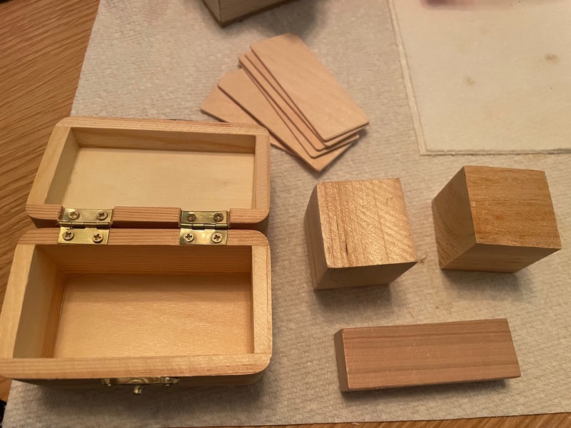 I started off by painting the wooden boxes and the Jenga pieces a dark brown and then finishing them off with a brown finishing wax. 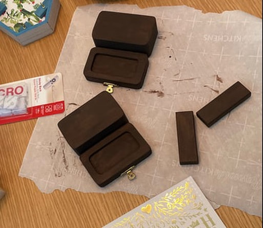 The wooden Jenga blocks got attached to the back of the boxes to allow the lid to stand more upright. Without this piece, the lids of the boxes would have fallen down and not allowed the calendars to work correctly. As you can see in the photo above, the lids of the boxes have an indent in the wood in the center. I thought this would be a good place to do something fun with resin. I had some golden three dimensional stickers that I placed into the indents and then I filled them with clear resin up the rim of the indent.
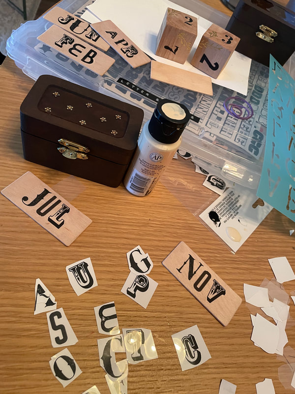
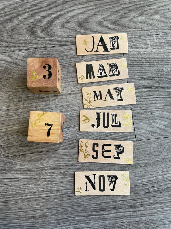
The wooden blocks are for the days of the month and the wooden popsicle sticks are for the months, with the idea being that the sticks would sit in the open cover of the box and the blocks could sit within the box. If that doesn't make sense yet, you'll see the calendars in action later! I liked the lighter wood color of these, so I just covered them with a light tan wash of paint to let the wood grain show through rather than a dark brown like the boxes. For each set of sticks and cubes, I went for slightly different style. For one set I used black and gold rub ons in all different styles. There are numbers on all sides of the blocks and the month pieces are reversible so on the back of the Jan piece is Feb, on the back of the Mar piece is Apr etc.
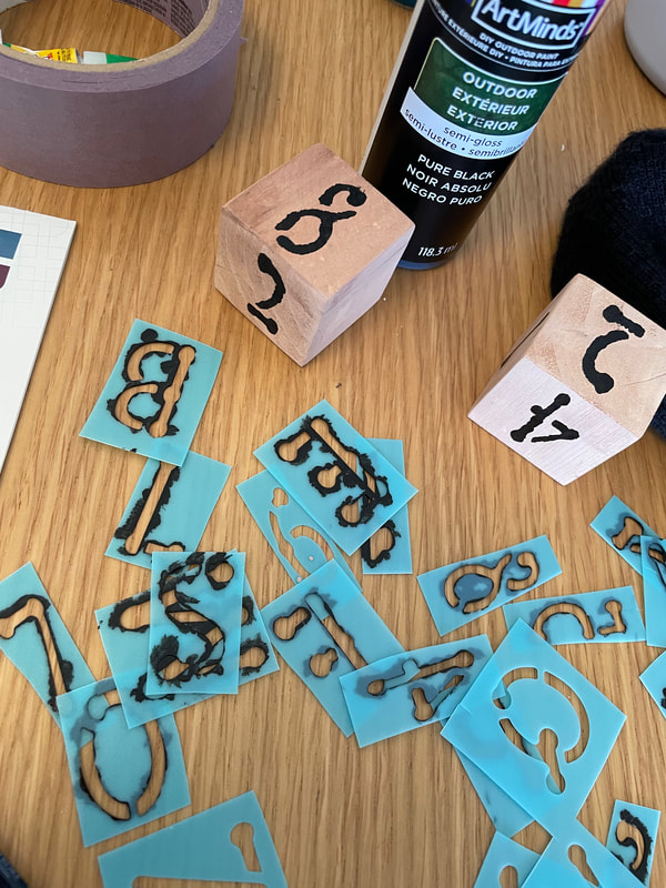
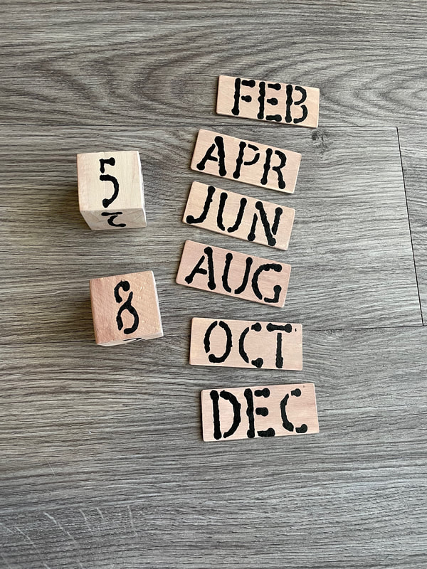
For the other set, I used a stencil my mother had found at the Dollar Tree and some black paint for a simpler look. All of the pieces for both calendars got a coat of varnish overtop to seal them as well.
And here they both are in action! The box can fully close with all pieces inside of it, then you can open it up and place the month in the cover of the box and the numbers on the body of the box. The extra month pieces fit perfectly in the bottom of the box under the number blocks.
And this perpetual calendar journey is finally complete! Which type of calendars did you guys like better? Let me know in the comments below! My hope is to get these on the Etsy shop in the next week or so as well so keep an eye out if you are interested!
- Rebecca P.S. Today's photo on the homepage is from Pixels user Александар Цветановић: www.pexels.com/photo/brown-wooden-block-desk-calendar-displaying-september-13-1425099/ |
AuthorI am a 27-year-old crafter and baker from New Hampshire! Archives
April 2024
Categories |
 RSS Feed
Proudly powered by Weebly